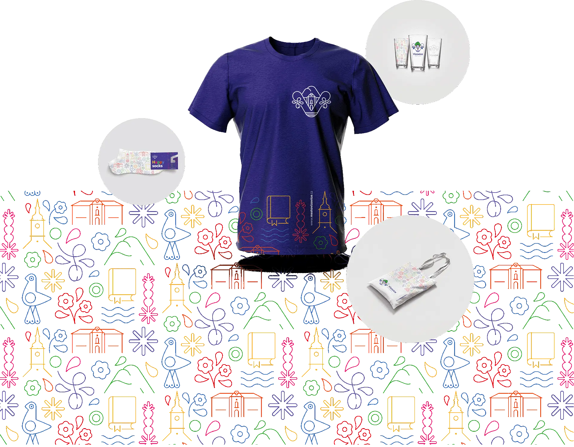
Visual Identity of the Town of Vizovice
Town of
Vizovice

A Visual Identity for the People. A City for the People.
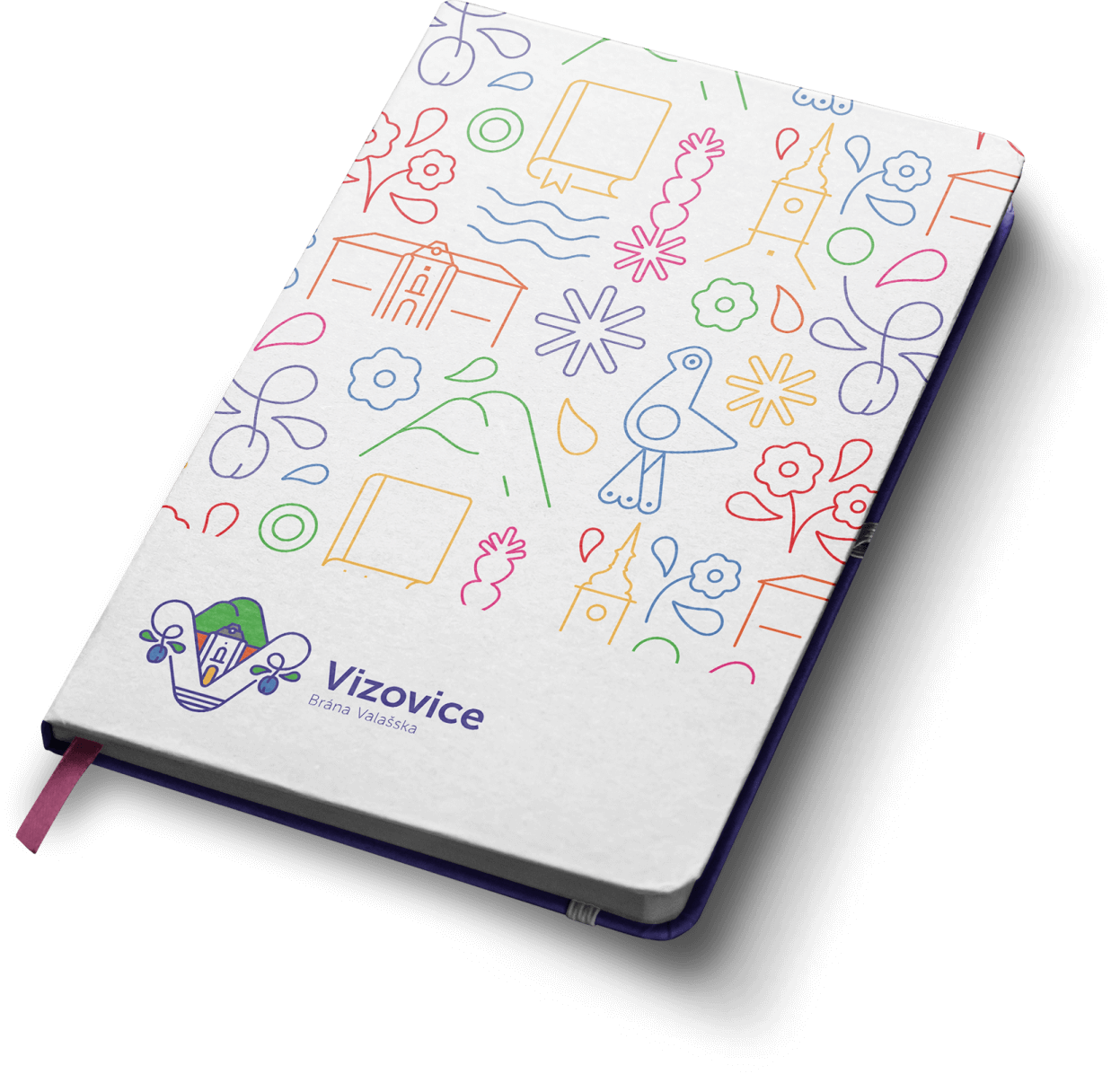
Vizovice, a city full of culture, traditions, and an unmistakable atmosphere. A place where history blends with modern times, and every corner tells its own story. Our task was to create a visual identity that wouldn’t just be a logo but a living reflection of the city itself—an identity for the people of Vizovice, who will see it for generations and feel a part of themselves within it. We wove motifs of nature, tradition, culture, and plums into every line and color, ensuring that each element spoke the same language as the city.
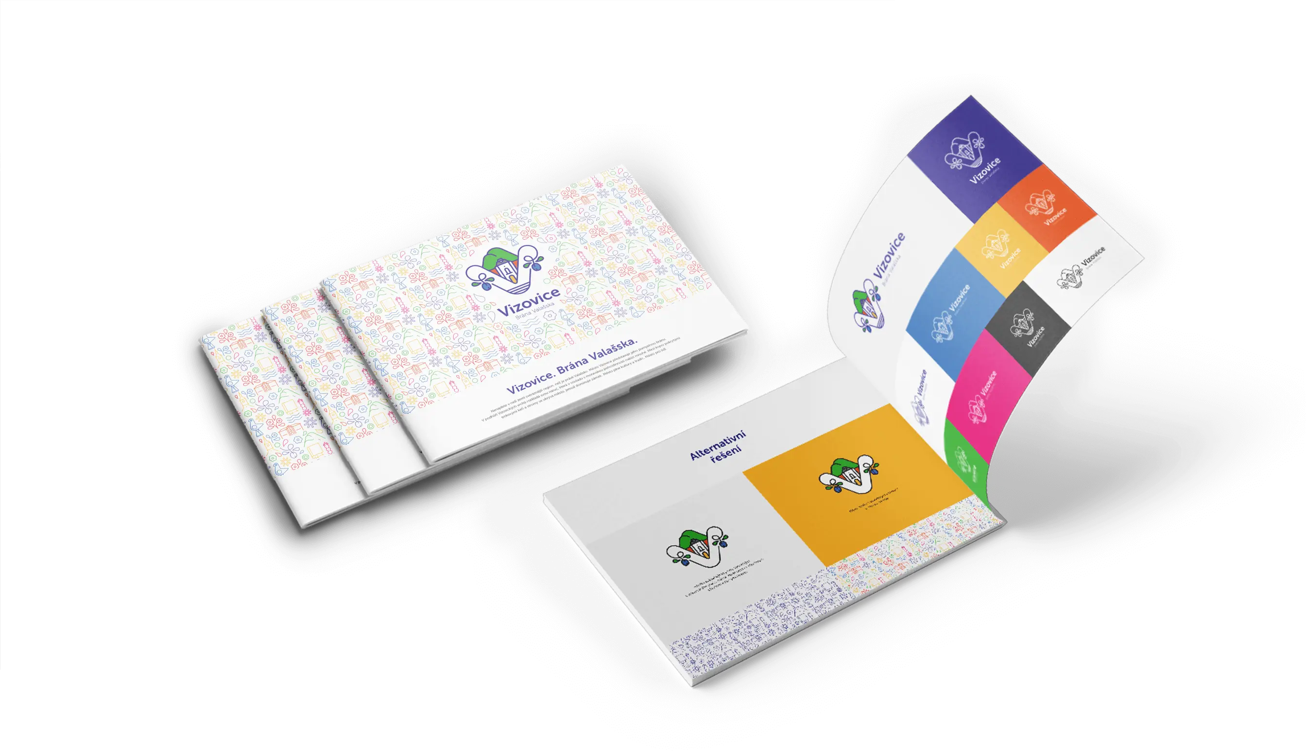
Our Approach?
The creation of the new visual identity began with a deep dive into the heart of Vizovice. We explored its history, absorbed the atmosphere of local traditions, and listened to the stories that make the city unique. Our designs combined modern aesthetics with the essence of traditional motifs—resulting in a look that resonates with both the past and the future. Our creative process was not just work but also discovery, with brainstorming sessions and discussions over every detail leading to designs that embody the city’s spirit.
Key elements, such as motifs inspired by local customs and the landscape, were at the core of our designs. In every curve and color shade, we sought authenticity that would feel close to the people of Vizovice while remaining visually appealing.
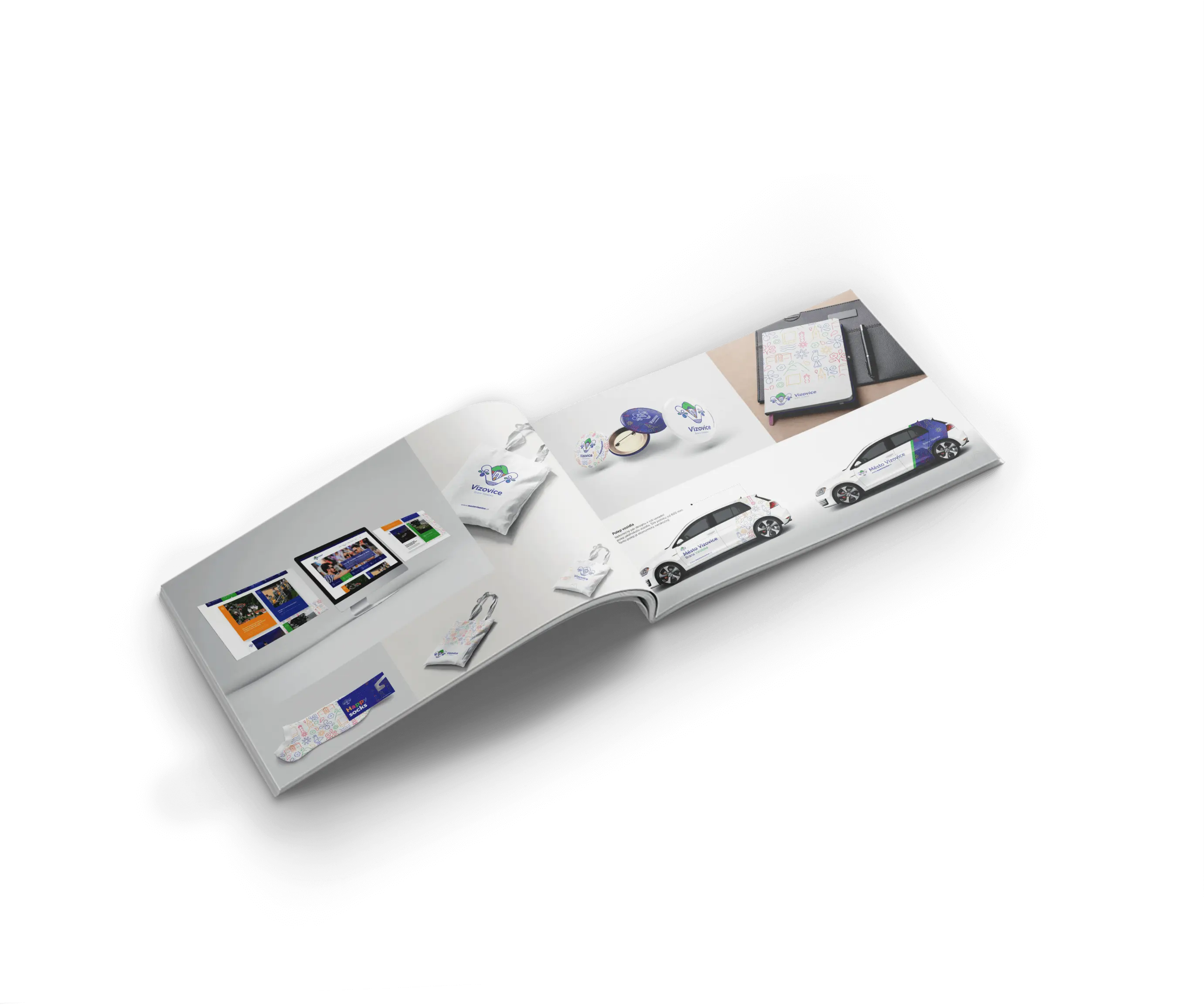

How the City’s Symbol Was Born: Our Journey into the Heart of Vizovice
Creating the city’s symbol was not just a graphic task; it was a journey into the soul of the city. We walked the streets in our minds, feeling the atmosphere, meeting the locals, and soaking up their energy. What awaits us there? What stories do the cobblestone streets tell? We wanted to capture it all—the traditions, the scents, the colors—and distill it into a single emblem.
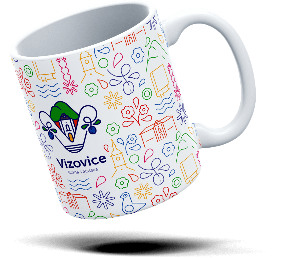
The letter “V” in the logo is more than just a letter
It’s a gateway to the Wallachia region, an image of the city nestled at the foot of the Vizovice Hills. The emblem encapsulates culture, traditions, and the symbolic plums so significant to the locals.
The gateway
of Wallachia..
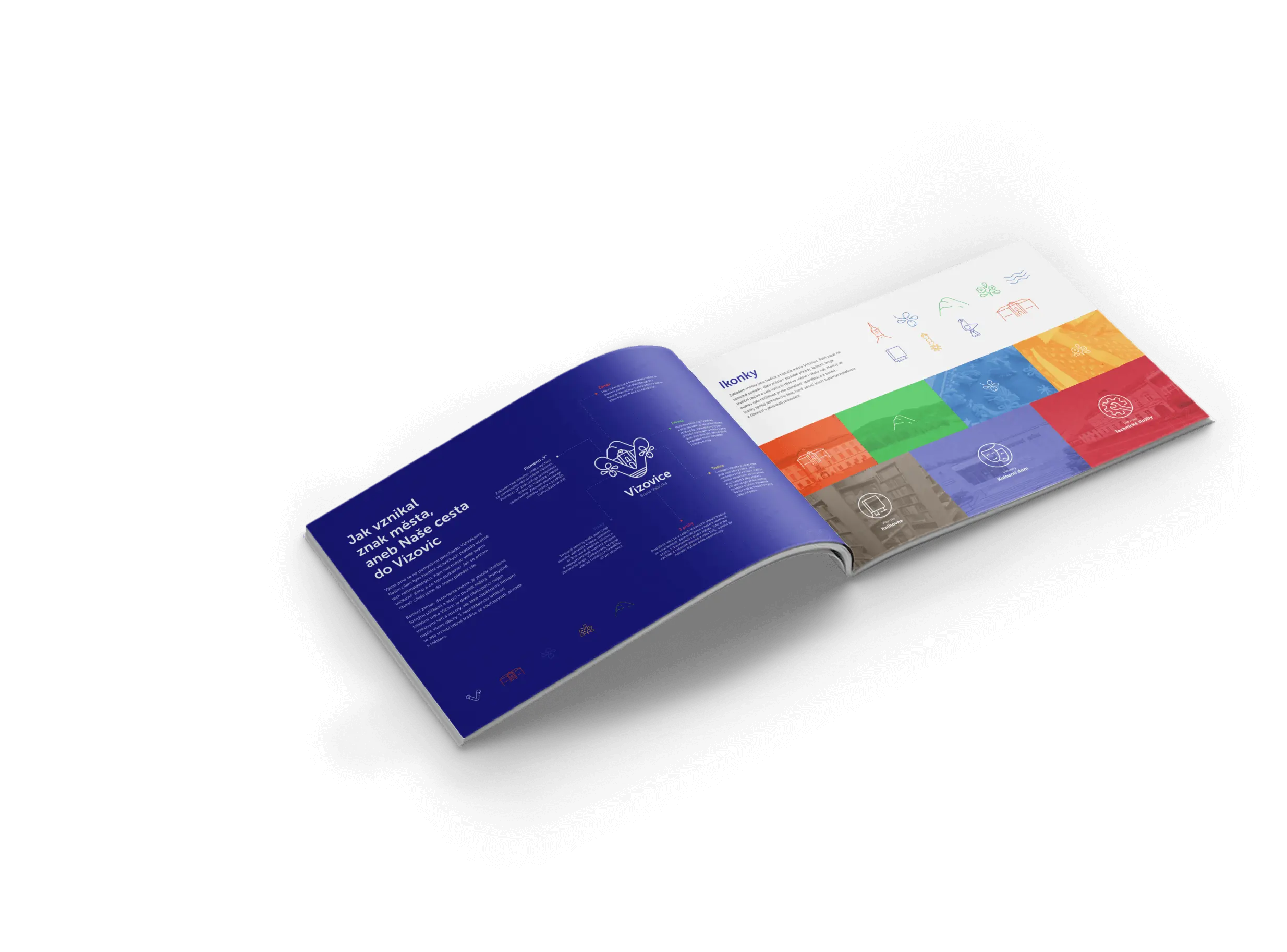
Tradition, culture, plums
When creating a visual identity, we place great emphasis on deeply understanding the client and their brand. We start with a detailed analysis of the client’s history, culture, and values to grasp what is important to them. Every design is carefully thought out and includes specific design elements that embody the essence of the brand.
Our goal is to create an identity that is not only beautiful, but also sustainable and relevant in the long term.
The Tender Process: An Experience Worth Having
It was an honor to participate in the tender process, even though we didn’t ultimately win. Our work, however, was more than just a competition—it was a journey full of creativity, fun, and team collaboration. We congratulate the winners and cherish every moment we invested in this project.

Lose Or Win?
